What better industry to discuss the subject of clinging to the past than the financial industry. One foot in modern times, and the other always clinging to what’s worked before. This article explores how the financial mechanisms of our daily lives are greatly influenced by generations past, and where it’s all possibly going. Let’s start off with the so called smart ATM experience.
I’m standing in front of ANZ Bank’s new generation ATM machine labeled “Smart ATM”. Curious as to the differences a smart ATM would have, I fling my bank card into the card reader. In my mind, the name “Smart ATM” implies its predecessors and competitors aren’t smart or less smart, like what smartphones did to feature phones. And that some combination of the machine’s hardware and software design offers a new level of intelligence in its behaviour, functionality or intuitiveness.
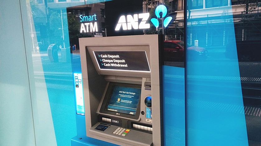
As I would with any other ATM, I jumped through the all too familiar hoops, plugging away at the touch screen prompts, to eventually be rewarded with my own money, $2 ‘privilege of holing my own money fee’ and all. Two crisp $50 notes popped out of the machine and my “smart” experience was done.
Walking away and reflecting on the experience, other than sporting a slightly larger video touch display and an ability to do deposits, at no point did I mistaken this ATM as differing from others I’d used either recently, or frankly in the past decade. Later, I decided to search the term “Smart ATM” on ANZ’s website to perhaps uncover what in fact the differences are, which yielded 355 wildly unrelated results.
This led me to think… just how long
have we been doing the whole ATM
experience this way?
Now in all fairness to ANZ, this article isn’t looking to bash their offering in particular, a quick look at the entire fleet of ATMs across all the institutions shows there’s little in terms of innovation across the board. They’re all heavily influenced from version 1 design. One could say that this is to avoid complicating use of these devices as consumers are accustomed to a particular way of them working. But another could say it was never particularly well designed to begin with. What were we smoking exactly back in 1960’s and 70’s design anyway? A trip around a house or office building from that era would reveal a litany of epic design fails in insulation, electrical design, water delivery, sewage and gas service that took decades for society to weed out. Not to mention some of those rather peculiar floor plans and structural designs.
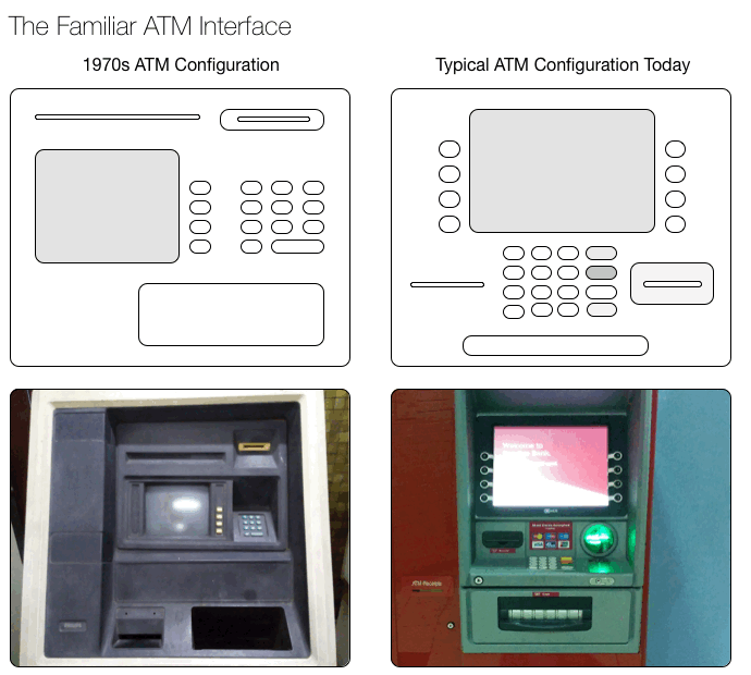
In looking at the diagram above comparing 1970s ATMs with modern day counterparts, yes general aesthetics and ergonomics of modern machines have somewhat improved; but the actual user experience and configuration of the various inputs and outputs remain largely similar. Most apparent are incremental changes to the size and layout of interface elements and material refinement. Not only that, but when you compare modern ATMs to each other there’s little variation, nobody stuck their head out with a revolutionary design. The current ATM landscape feels like ‘Attack of the Clones’; whether bolted into a wall or into a case, and regardless of brand, ATMs were all seemingly shat out of the same assembly line.
I won’t even get into the complete lack of accessibility these machines offer. Where awareness of accessibility needs have increased in past decades, ATM innovation hasn’t kept pace. Even as someone with a “tallness impairment”, such as myself, it’s that awful combination of shroud covered keypad, millimetre viewing angle screen and the all-time favorite unaligned push buttons along either sides of the screen that leave a bad taste with every interaction.
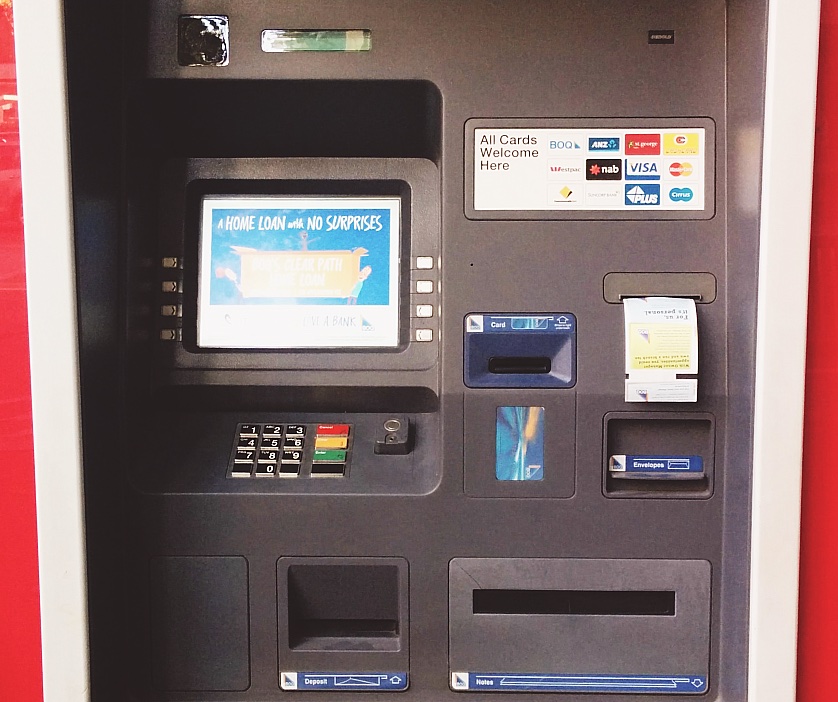
There isn’t anything about this machine that isn’t disappointing.
A final testament to the sad state of current ATM machines is the above pictured hapless, currently in service, BOQ ATM. This isn’t an archival photo, yet appears to almost have gone backwards in ergonomics and design logic from its 1970’s counterparts. The layout of card inputs, receipts and cash quite literally take a shotgun approach, and there it is churning away in 2015.
But it doesn’t actually stop there. The very form of authentication you use to obtain money from these ATMs and make payments with is itself flawed with hideous amounts of legacy and backwards compatibility weight. While it isn’t something one thinks about often, if you consider your modern day credit card, it’s in fact burdened with supporting four different generations of technology compatibilities, requiring it to maintain the form factor and design it’s had for decades.

There are other distinguishing features such as holograms and so forth, but they hold little significance in modern practical usage. When was the last time a credit card was inspected at point of sale either for signature accuracy or that the hologram proved the card’s authenticity? Likely not even on your mental radar.
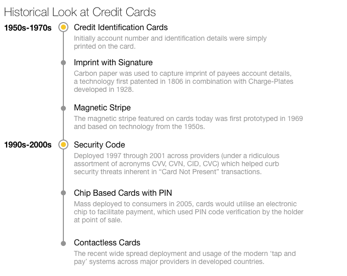
It’s amazing when looking at the date of magnetic stripe technology, and the resulting first fleets of ATM machines going out into the wild, adoption of the technology was quite rapid for the era. Given what we’re seeing in terms of smartphone payment capabilities over just the past year, it’s clear these cards have a short lifespan remaining, phones eagerly want to replace them. As of the past year, they’re finally starting to make the leaps in technologies and infrastructure deployment to make this a reality. But what about until the day we are all whipping out some sort of device to make payments?
Is hope on the horizon?
There are signs things are changing in ATM land, sightings of UCD and technology improvements are giving hope. I believe we’re in a pre-Apple state of the ATM; computers were ugly masses of grey and beige metal and plastics before Apple brought form into the equation. A similar occurrence is likely to happen to ATMs in the not so distant future as banks further retract retail outlet numbers and grow their dependence on ATMs. This increased dependence will force a rethink of their design, as user experience will truly become business critical to growing and maintaining customer counts and their satisfaction.
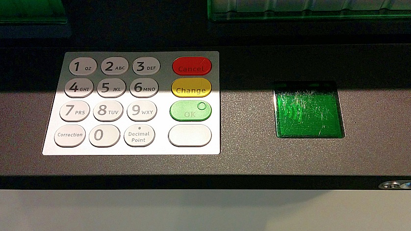
Contactless ATM Technology
A recent trip to NAB (National Australia Bank) headquarters turned up new generation ATMs. They’re trialling (although non-functional at the time of writing this article) contactless card authentication ATMs. This is clearly the direction ATMs need to go given a bulk of the country has mostly been transitioned over to contactless cards years ago. There’s a myriad of benefits, less card exposure time to increase safety, the need for card removal at the end of the transaction is eliminated, and both reliability and security are likely improved over traditional card readers (at least until hackers figure out how to intercept and decipher contactless transactions). Too bad it’s paired with the prehistoric numeric pad to its left.
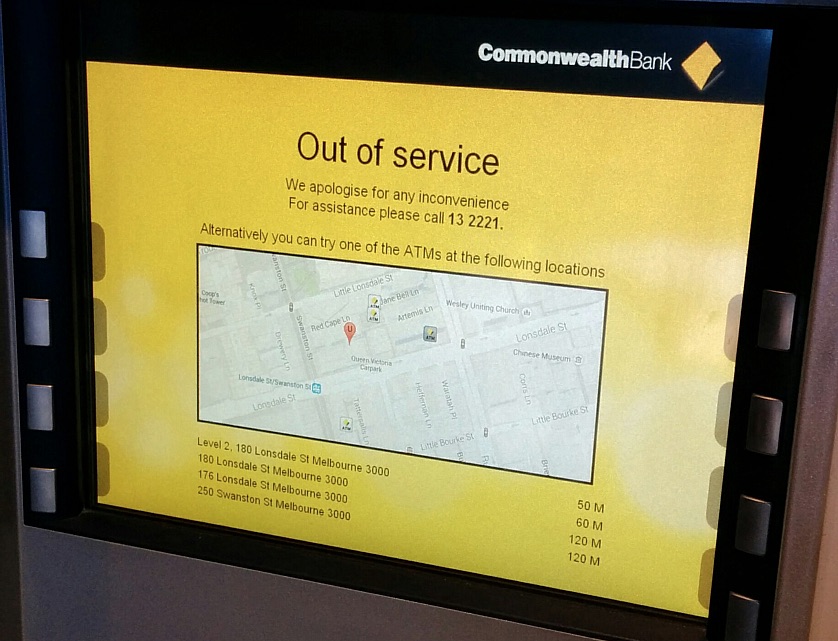
Kindly Out of Service
Possibly some of the stronger evidence yet that banks are thinking about their ATM’s user experience is Commonwealth Bank’s out of service screen, which kindly provides a clear and prominent customer service number, along with locations, distance and even (gasp) a map of alternative ATMs within a reasonable radius. Hats off to CBA, welcome to 2015!
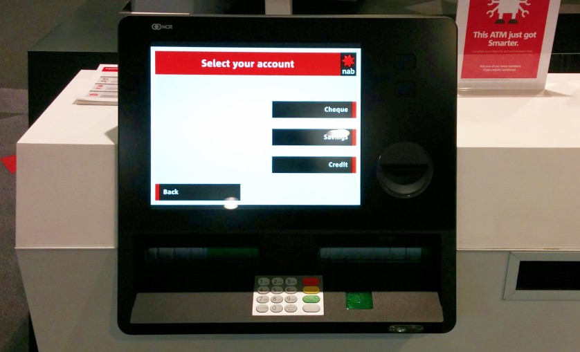
High Contrast Larger Touch Displays
With all the innovations in touch screen technology, it’s shocking to see how many ATMs still rely on ill conceived buttons adorned along the sides of screens to select options. The screens NAB fitted to its latest generation ATMs are large, clear, high contrast and use simplified interface designs to get you through the familiar prompts.

Thinking About The Total Experience
The ATM user experience is not limited to the machine itself, but also to the environments they’re placed in. Spaces dedicated to ATMs in bank retail outlets are typically a pretty drab affair. Outside of banks, ATMs are often oddly slotted into pretty much anywhere, and as a consequence their contextual experience is rather lacking. Randomly up against support columns in shopping centers, strange crevices along strip malls, and as you move from developed to developing countries you awkwardly find a lot of your ATM transactions are in hellish telephone-booth-meets-coffin structures out in parking lots and along roadsides.
Those faces of sheer excitement in the ATM lineup pictured above took place in a new generation bank retail outlet, part of a wave of newly inspired retail designs sprouting up across Melbourne’s CBD. While many have a mixed level of success in solving customer experience matters, Bank of Melbourne went to great lengths to design their ATM space as a more satisfying environment, a space you don’t mind being in. Details such as selection of flooring, ambient light fixtures, full floor to ceiling glass looking out to street level, simple entry and exit ways that leverage its street corner position were all carefully thought out. Most engaging is the beautiful high resolution video wall that surrounds the wall mounted ATMs. Animated patterns of various descriptions float across the wall, with an end effect that feels contemporary, interesting and unique (if not a bit rave-ish).
Who’s Doing Anything About The Future?
So what if we pulled the cord on the current jumble of ATMs and started again fresh with a UX approach? IDEO in conjunction with a a variety of hardware and software partners have come up with exactly that, currently being trialed in the real world. It’s an excellent example of how new user-centered design thinking can really change a product category. It successfully blends a rethink on the experience, while maintaining familiar concepts so not to risk alienating users with something too dramatically different. However, the biggest hurdle isn’t in fact designing the new ATMs, but rather adoption, financial backing and mass deployment by financial institutions.
What About Those Credit Cards?
The staple of any good user experience is consistency. The unfortunate hurdle financial institutions face is migrating their millions of global transaction points, be it retail or ATMs to a single unified authentication system, thus eliminating the need for the legacy design we walked through earlier. Until then, the variance in ATMs and point of sale terminals will continue to hold back progress on new card design and migration to device based transactions. It’s simply a massive undertaking to transition the world’s credit card handling, developed nations or not, to expensive new technologies.
A Parting Gift
Yes this article is somewhat of a whinge fest, but really, the industry needs a kick in the bum to get some momentum on this matter. And in case you still feel I’m unjustly singling out the financial industry on antiquated design, let me leave you with a tribute to website design of decades past, a screenshot of the HSBC Australia home page, taken today in the year 2015, enjoy. 😀


