

We’ve all visited websites only to be slammed with animated pop-ups, fly-ins and other annoying widgets pleading for your feedback on their website and products (often before you’ve even had a chance to use either). Most of us have also received store receipts, emails and letters urging us to participate in online surveys and questionnaires, sometimes dangling things like cash prizes as incentives. If the conditions are right, you might say to yourself, “Heck, why not… I’ve got a few minutes to share what’s on my mind.”
Upon accepting the challenge to participate in online questionnaires and surveys, you’re promptly whisked away into the oddly sterile alternate dimension of Questionville. It’s often a disconnected experience, that seemingly takes forever and has lots, and lots, and lots of questions. Wandering the inhospitable streets of Questionville, you teeter between seeing your quest through to the end and bailing out without notice – opportunities to spill your guts, countered by prying mandatory questions.
It’s all too easy to just close the browser window and resume life. I’ve bailed many times. Not because I didn’t want to participate in potentially shaping their products; but because they made it such a horror show of an experience and did little to assure me there was ever an end to the interrogation, or that my contribution wasn’t going to get drop kicked into an eternal black hole.
But what if it wasn’t like that? What if I almost… WHAT?… enjoyed the experience. Let’s delve into what irks users and contributes to low engagement, questionnaire abandonment and false result data; and offer some simple remedies to level up the experience. We’ll truck on through a full end-to-end example from Dell, critiquing without mercy; run through a customer survey from HP for a printing product; then finally we pluck various customer survey examples from the food and beverage industry. It’s a mixed bag of questionnaire designs spotted in the wild for your learning pleasure, bon appétit.
Dell Store Case Study
While an end-to-end analysis of the Dell Store questionnaire offers a gold mine of issues to study, it would be unfair to single out Dell in particular. Their questionnaire experience largely mimics countless other similar implementations on sites we’re all likely to bump into at some point or another. Its design, layout, behaviours, rate of progress, inputs and interactions are common in many questionnaires – Dell’s certainly wasn’t the first or last with these characteristics.
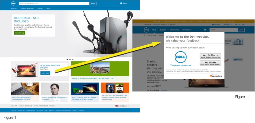
Dell’s webpage loads (Figure 1) and I immediate come across a promotion for the XPS 13 notebook, curious to have a look at the specs and pricing I click to learn more. No sooner did the product page load it was covered by a light box (figure 1.1) asking to participate in a questionnaire about the website. The immediate reaction is “Let me at least see the site first?”, a similar reaction to an over zealous restaurant waiter asking how the food is before you’ve had a chance to eat it. Everyone would be too busily smashing anything that resembles an “X” or a “No, thanks” to realise the wording actually asks to provide feedback AFTER using the website, by means of a convoluted popup launcher scheme…
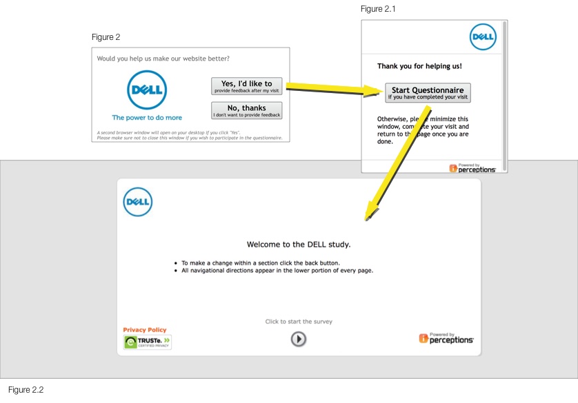
Clicking “Yes, I’d like to” spawns a small fixed-size browser window (Figure 2.1) with a button boldly prompting you to “Start Questionnaire” along with an easily missed “if you have completed your visit” shoehorned underneath in small text. Then confusingly printed under the button it suggests to minimise the window into your pile of other open browser sessions and manually reopen it once finished using the web site.
Seriously, nobody has this level of patience to follow along with reading such instructions on a popup – there’s vast exabytes of Internet out there to explore. With so many techniques for launching the questionnaire invite after surfing away from the domain or upon closing the browser or launching after a longer period of use, this reeks of years past attitudes of making the user work to overcome technical limitations.
Assuming you do hold off clicking “Start Questionnaire”, you comply like a good little user by minimising the browser window and continued on your merry way shopping and exploring. Several minutes later, you’re done your journey through the site, and provided that hilarious presidential election meme your friend just sent you hasn’t distracted you from remembering (through sheer magic), you maximise that pop-up window and click “Start Questionnaire”.
Yet another browser window is spawn. Welcome to the world’s most uninspiring web page of all time (Figure 2.2). You’re greeted with “Welcome to the DELL study”, whatever that means. No explanation of what the “study” is for, what will be asked of you, time commitment, zilch. Only instructions to “click the back button” if you mess up (and no not the Back button YOU think it is, the Back button THEY think it is) and that the navigation is at the bottom (which if done properly would have been self evident by design). I can’t stress how life sucking this page is. It’s like getting a driver’s written exam paper and looking at that abysmal cover page of instructions that you ignore because you know how to fill out a multiple choice test, duh.
Like a dog let off it’s leash to frolic in the park and pee on various playground equipment, I click the arrow button (handily labeled with “Click to start the survey”) and I’m off and running…
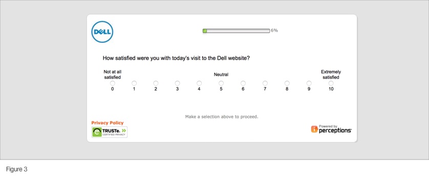
How satisfied am I? The interesting thing about an 11-point scale is, like a trip to the shampoo isle of a supermarket, it presents too many options too similar to each other. Without definition around what a 6 versus a 7 means, the user burns more cycles grappling mentally with where to position their response in the scale instead of reflecting on their experience. And really, what does a 6 or 7 translate to upon collection and trending on the business end? A 5-point scale would have simplified the interface, user’s decision making process and ultimately interpretation of the resulting data.
Moving forward, let’s just replace the central content of the screen as we move along, trust me, nothing else changes except the progress bar…
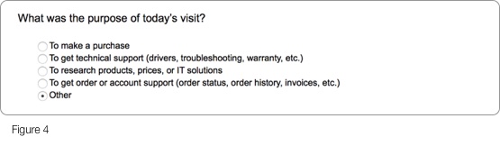
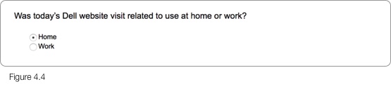
Whether I’d proclaimed my experience as a hatred filled “Not at all satisfied” or glowing “Extremely satisfied” on the previous step, I’m asked why on earth I came to the site (Figure 4). It’s as if there’s no consciousness of how the previous question was answered.
Scanning through the list of purposes, if I click “Other” and proceed forward, the questionnaire turns it’s head away disinterested in what that other purpose could possibly be. A missed opportunity to know motives of users that fall outside of the pre-defined set of purposes the business has identified and listed. It could have easily been handled with a text box, a drop down with more elaborate options, etc.
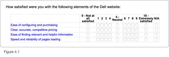
Now that my purpose has been established (or not), it swings back to satisfaction ratings again (Figure 4.1). We were discussing how 11 options was perhaps too granular. Now we’ve got 48, packed into a space befitting of Stewart Little. How is it that when presenting a series of options in the sales side of the website, such as configuring a notebook or when selecting tiers of a service, every pixel and molecule is painstakingly crafted; but when they’ve finally captured someone willing to talk candidly about their product it present them with this table design throw back teleported from 1998? Users want breathing space between elements, well proportioned text, easily selectable inputs and they want modern visual aids to help guide their use.
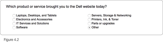
It’s funny, proceeding to the next step, we’re now back to the whole “why are you here” topic (Figure 4.2). Questionnaires, just like other user journeys should have a logical flow, a progression that feels like a story the user can mentally follow along. Every time they’re jerked back and forth it throws off the plot, just like in a book or movie. And again, if the user came for something not listed? Opportunity missed to know what that was.
Amazingly the input method is radio selectors, meaning if you came here for more than one thing (say both a laptop AND (gasp) a printer) you’re stuck picking one. It may try to force selection of the primary purchase, but how does the user determine that? Desktop over peripheral? High versus low product price? Product over service? Why does the user have to choose? Checkboxes would have offered a greater insight into what products they were interested in, again saving the user from having to think about which to selection.
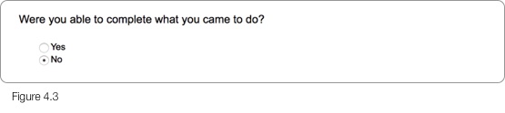
When asked if I completed what I came to do (Figure 4.3), a “Partially” completed option would have again addressed a middle ground not being served. Allowing the user to indicate their needs were partially met (could buy the notebook, but not the extra battery pack) saves them from incorrectly defaulting to the next closest option, “No” which loosely says their whole trip to the site was a failure, unjustly throwing off customer satisfaction scores. The major objective may have been met, while a secondary or nice-to-have might have been what forced them into a “No” selection.
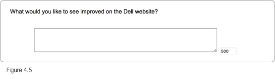
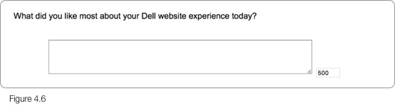
I’d recently responded to a customer satisfaction questionnaire for my bank, in which I expressed dissatisfaction with their less than stellar handling of urgent foreign banking procedures, I can assure you it needed over 500 characters to articulate the issue (Figures 4.5, 4.6). Yes, some people ramble on (hey, don’t point at me) and 500 characters helps keep it as focused as you’re realistically going to hope. But ultimately it’s just an unnecessary limitation, with 500 characters likely an arbitrary number that ‘sounded about right’ anyway. Most responses will likely be a couple sentences that vaguely resemble English, but for those that want to put the effort in, you don’t want to cap them. By limiting the user haphazardly, it limits their contribution; if limits are imposed, it should be due to technical reasons… or you’re Twitter.

Persistent through this experience are the progress bar and navigation. The progress bar does little to in fact show your progress except as to say you’re a percentage through something that has no definition. When I open up an article in Medium and it’s a “14 minute read”, that’s clear. But what does 30% mean in an unknown process? And do responses to questions impact that rate of progress? By defining the estimated time of completion up front based on the average of other respondents, the percentage means something, or better yet express it in approximate time remaining.
Navigation often wrecks questionnaires. Back and next buttons are often (as shown) clumsy arrow buttons crunched together with no hope of being usable on touch devices, or for that matter without laser accuracy on a desktop. Why does this keep happening? Large with decent separation is a good thing, and having progression buttons to the far right better indicates progression and is the anticipated placement for such buttons.
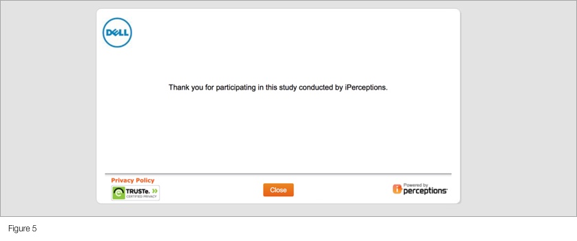
Given that time, which I’d just spent a decent portion of, is the most precious thing I can give, the grand finale is thoroughly anticlimactic (Figure 5). It’s a yard stick distance hug of appreciation, saying to the user “We’ve got what we need, that will be all with you. Move along.” I have no idea what will happen with my contribution, how it will help, how I can be further involved, opportunities to know the outcome, an invitation to participate in more “DELL studies”. I’m basically given one of those disingenuous “thanks” where your gut’s telling you it isn’t really thanks. How does this make me feel? We literally need a questionnaire for the questionnaire.
If someone approaches me on the street, dressed in well coordinated official branded attire, introduces themselves, has an affable personality and states the purpose, what’s involved and outcome of a questionnaire they’d like to conduct with me, I’m likely to participate. If that same person comes dressed in drab clothes, tells me nothing about the questionnaire and either limits my responses or makes me jump through hoops to participate, I’m not interested. Why is it any different in the digital realm?
Two Smiles by HP Case Study
Keeping with the theme of technology, here’s a look at select screens from a customer survey for the cringe-inducingly branded “TwoSm;)es” card printing kit by HP. Aside from the brutally rudimentary design of the survey, there’s a number of things we can learn from it’s execution.
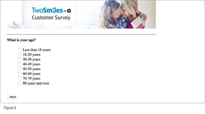
Both the crammed together radio inputs and the easily missed microscopic “Next” button that necessitates finicky precision to click (Figure 9), point to dated form design that doesn’t consider today’s high resolution screens or modern design patterns. Users expect large, well spaced and easily read at a glance typography; breathing space around selectable elements; with easily selectable cards often replacing radio inputs; with appropriately positioned and proportioned page navigation.
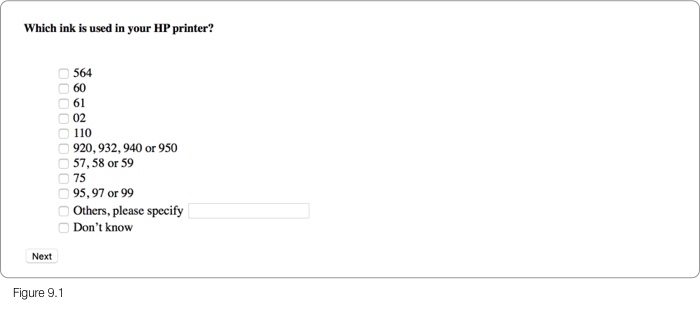
Anyone that’s gone to buy replacement ink cartridges at the office supply store knows recalling the specific ink model compatible with their printer when faced with a wall of options is problematic. The page asking for ink specifics in Figure 9.1, wrongfully assumes model numbers are either committed to memory or are readily available at arms length. The more likely scenarios are either having to sift through manuals and websites or opening the printer, yanking out the cartridges and looking for the model numbers. It’s this expectation of manual work combined with a list of unordered model numbers seemingly vomited randomly onto the form that begs the typical user to jump ship. Wouldn’t asking for the printer model make more sense, given it’s greater likelihood of being within sight and that the ink cartridge model aligns with the printer? It’s not only easier for the user, but gives both cartridge and printer model data in a single question.
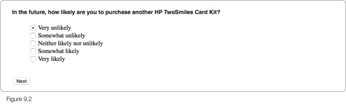
When asked how likely to purchase again (Figure 9.2), the order of the scale interestingly goes from least to most positive response. If we stop and think about how people typically perceive such vertically aligned selectors for things such as feedback or product tier selectors (at least in western societies); it would be with positive and higher worth options atop, followed by progressively lesser options below. This form would have benefited from a reversed order, along with clearer spacing to more easily digest the options at a glance. Compounding the matter is the redundancy of “Very” and “Somewhat” used as the prefixes for both negative and positive ends of the scale, making differentiating either end a challenge.
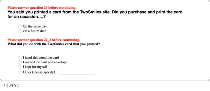
Proper error handling is important for good survey design, it’s the difference between a stuck user and one that gets back on track. A critical heuristic of form usability is in it’s ability to clearly communicate its status to the user. Forms of all types often struggle with error handling, seemingly treated as an afterthought. Case in point (Figure 9.3) where the error messages likely came “out of the box” pointing to question numbers and even question sub-numbers invisible to the user with no customising or reference to the specifics of the survey questions.
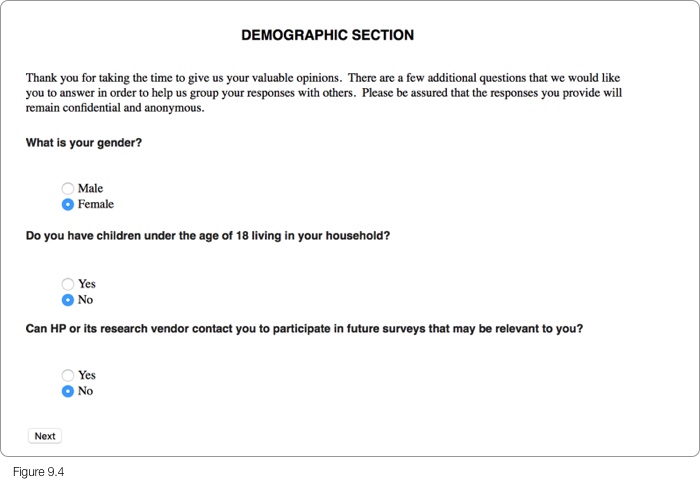
Nothing conjures warm and fuzzy feelings like a survey page asking you to share details about yourself titled “DEMOGRAPHIC SECTION”. HP seems to have lost sight they’re dealing with consumers printing greeting cards for friends and family on their home printers. The content strategy misses an opportunity to speak in relatable terms that the average home user feels comfortable with. Honestly, even as a corporate user the title feels cold. Strangely enough after all that, the most obvious of demographic questions, age bracket, was in fact asked elsewhere, at the start of the survey.
Food and Beverage Case Studies
Let’s change gears and see how the food and beverage industry typically handles digitally surveying customers about their bricks and mortar experiences. Always fascinating to see how the real world is connected to the digital.
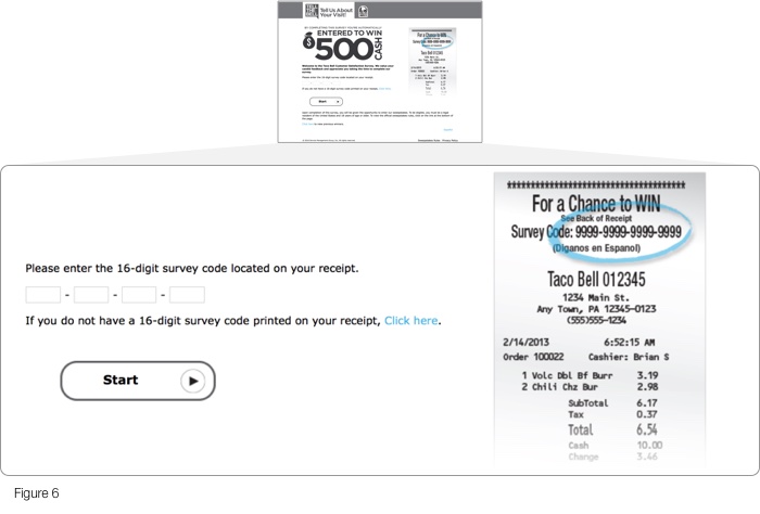
After you’ve finished shovelling fast food down your gullet (using the term “food” loosely), franchises on occasion request you participate in their online customer survey, often for a chance to win some sort of prize. The process of connecting that real world transaction with an online survey comes in various forms. Take for example Taco Bell’s survey (Figure 6). As a species we all universally despise having to enter lengthy license keys to unlock software purchases; so it’s unfortunate Taco Bell emulated exactly that by requesting a 16-digit survey code from your crinkled grease soaked receipt in the first step of their survey.
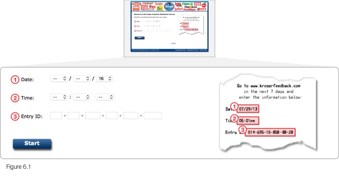
However it could be worse. Grocery store chain Kroger asks for a less than consumer-friendly termed “Entry ID” of similar complexity, along with date and time specifics of the transaction (Figure 6.1). This is obviously to compensate for technical limitations of being unable to carry timestamp data with the Entry ID, so guess who ends up with the task. While a commendable job was done of highlighting the receipt’s field locations and their corresponding input fields, more fields likely equates to less participation.
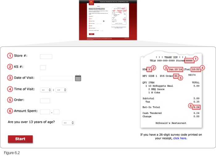
What would an example of too many fields look like? McDonald’s survey (Figure 6.2) asks you to transcribe a grand total of 9 input fields from your receipt. And if that isn’t agreeable to you, and your receipt sports a survey code, you have the privilege of entering a 26-digit survey code. Yes, that’s correct, twenty six digits. Consumers have made their distain for lengthy codes clear, surely by using alphanumeric codes you’d at least halve the number of characters, akin to the process of URL shortening. Have these companies not thought of this to lessen user burden? Every such overlooked opportunity for efficiency translates into higher potential for survey abandonment.
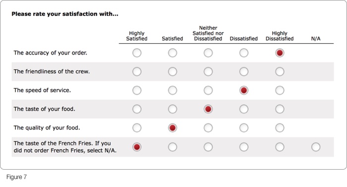
Continuing later in the McDonalds survey process, Figure 7 illustrates how a broad range of experience attributes are to be rated by a singular “satisfaction” scale. This begs the question, does a 5 point satisfaction scale best measure taste, accuracy, speed and quality? Or would greater insights and more authentic participant ratings be realised by using measurements that speak to each of the attributes. It’s debatable but worthy of considering when designing such questions.
Order accuracy, for example, can easily be a true or false, either you received your order as requested or not. Does it necessitate a 5 level scale, and if so, what differentiates satisfied versus highly satisfied when ordering a BigMac combo that came with Fanta instead of the Coca-Cola you asked for? Would the crew best be rated by satisfaction, or maybe by terms best matching the experience, “Approachable”, “Friendly, “Unhelpful” or “Indifferent”. Crafting tailored responses to each of these questions likely harvests deeper insights with little additional effort on the participants part than merely asking how satisfied.
Another way of looking at this, is whether a grid of radio buttons ideally captures such information, or does individual questions each with input methods best suited to the data collected make more sense. It’s not as if the user needs to comparatively score quality of food versus speed of service, they’re exclusive to each other. So why design the inputs into a grid that suggests or invites comparison? Not only that, but how much is too much? The screen following Figure 7 is yet another grid of radio buttons. A user’s tolerance for seemingly endless radio button tables to complete is finite. Ultimately when presented with such grids, as many of us have been, does your eyes glaze over and enthusiasm plummet? Probably.
Oddly enough, the last question slipped into the page asks about the French Fries experience you may or may not have had. It’s entirely unnecessary in this step, particularly given the upcoming steps, and throws the overall form design off-kilter.
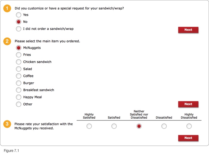
Questionnaires work best when there’s a linear progression, like a story, participants can better progress mentally through the experience and recollect the various aspects being asked of them. So over the course of the next three pages (Figure 7.1), it’s a baffling process design that firstly presumes what was ordered, then asks to determine the “main item” out of all that was ordered, then to rate that one item’s satisfaction. It’s a rocky road for the participant, but may have been deliberately designed with such inflexibility and sequencing for the needs of the study, difficult to say.
Ideally, that ridiculous 26-digit code at the start should link the questionnaire platform to specifics of the transaction back at home base. Enabling it to recall and display the ordered food items complete with consumer friendly labels and accompanying illustrations (instead of pictures that may influence perceptions). Depending on the size of the order, items may be rated individually, grouped such as with combo meals, categorised or any combination thereof, depending on the needs of the study. All on a single well balanced page, easily finished with a few clicks for the typical order. A more engaging and adaptive user experience, resulting in richer data through better use of technology.